 Image 1 of 1
INDEX
CLASSIFICATION Painting
TITLE Radishes III
YEAR 2026
DATE May 2026
MEDIUM acrylic and gouache
SUPPORT panel
DIMENSIONS 10 x 12 inches; 13 x 15 x 1.75 inches framed
SUBJECT food; radishes; flatware; table; glass; shadow; crockery
PALETTE baby blue; orange; naples yellow; hot pink; acid green
TECHNIQUE limited palette; from photo
TONE murky
PLACE Mattapoisett, Massachusetts
SERIES Radishes
STATUS Available; inquire
PROCESS NOTES
DAILY: https://www.rosemanning.com/daily/sunday-may-3
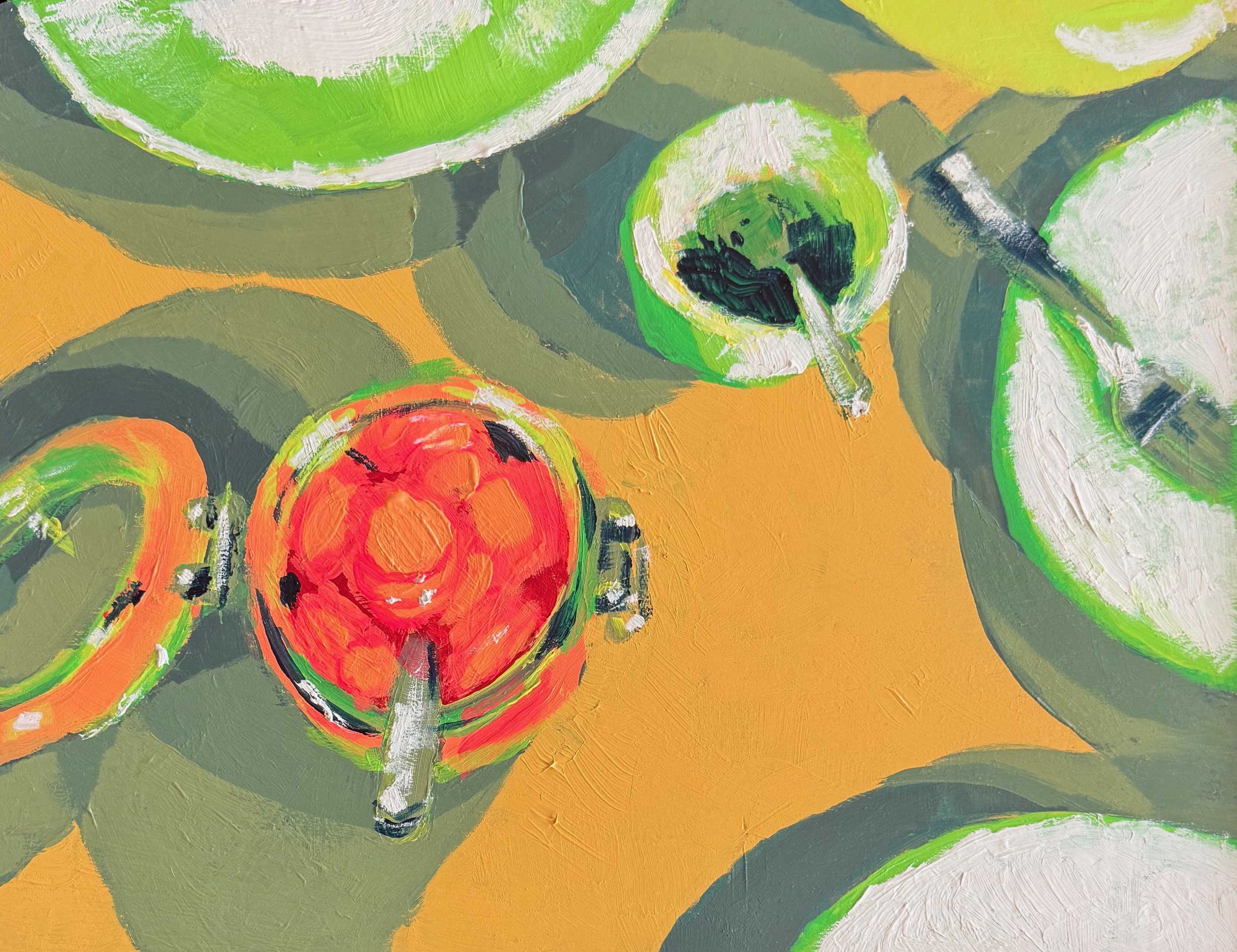
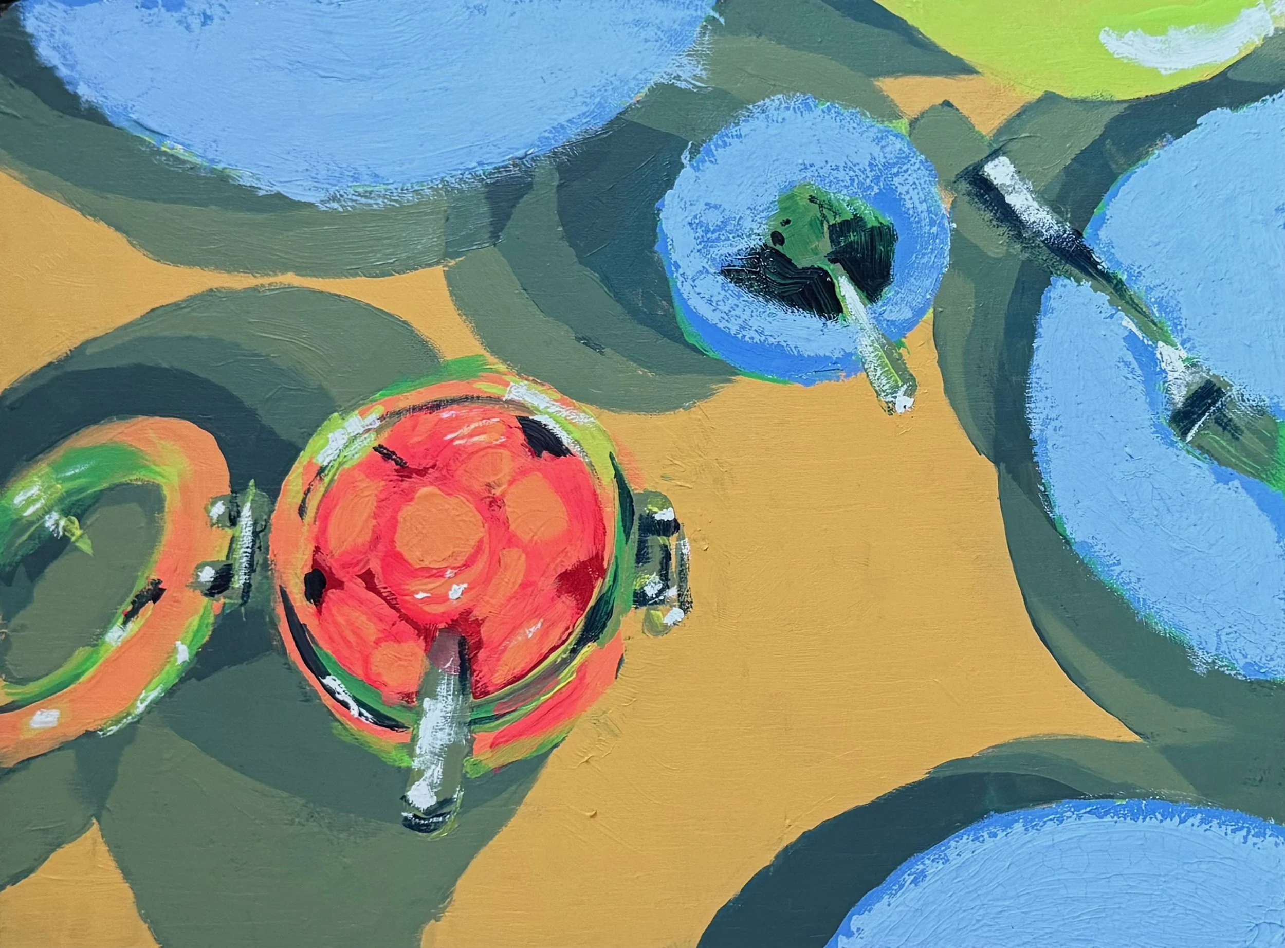
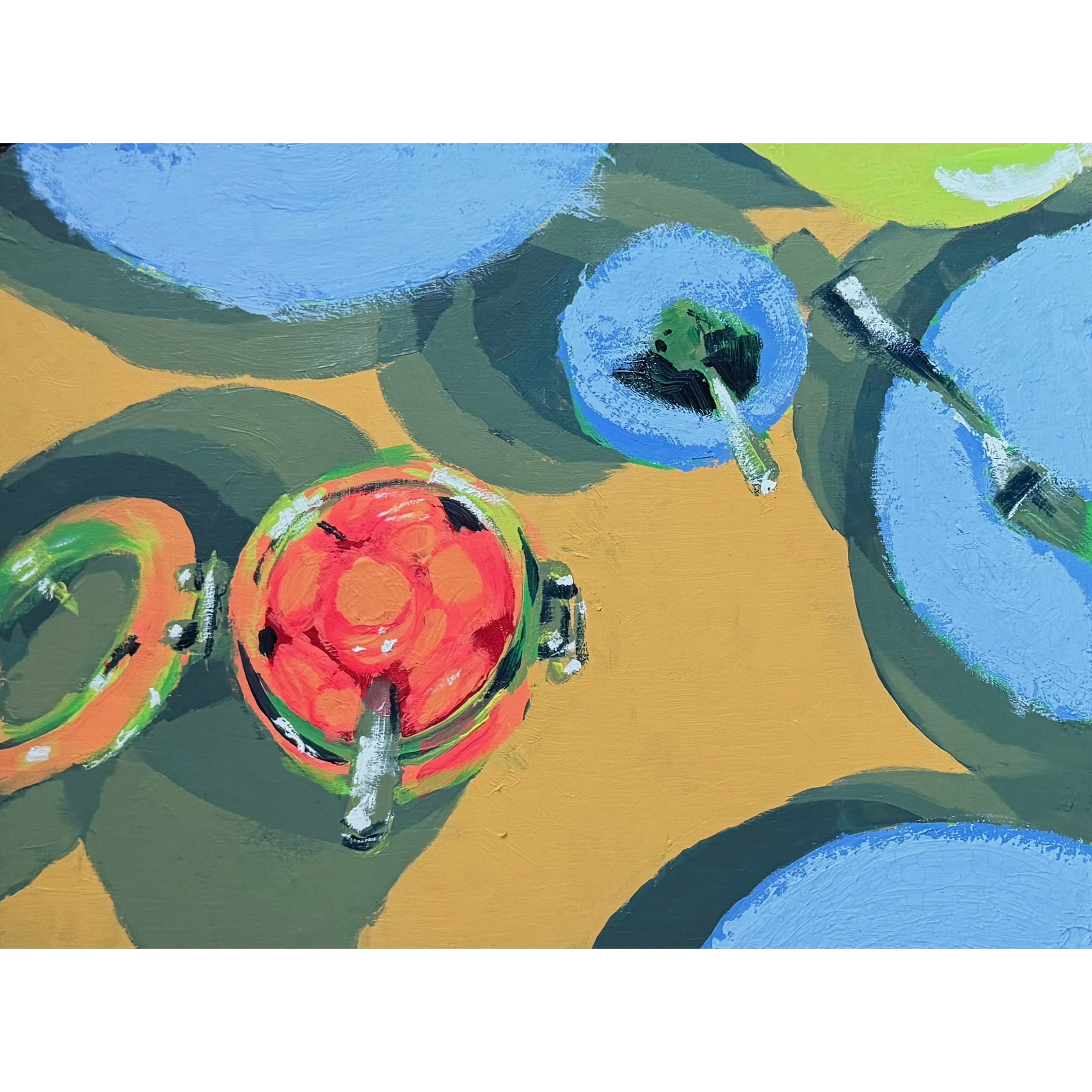
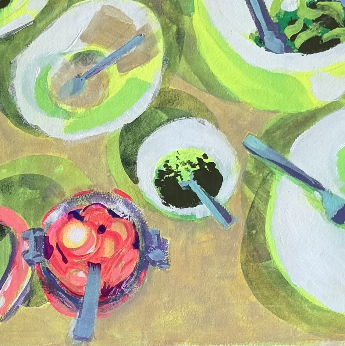
These radishes have captured my imagination. I think it’s the color. This is the third outing so far.
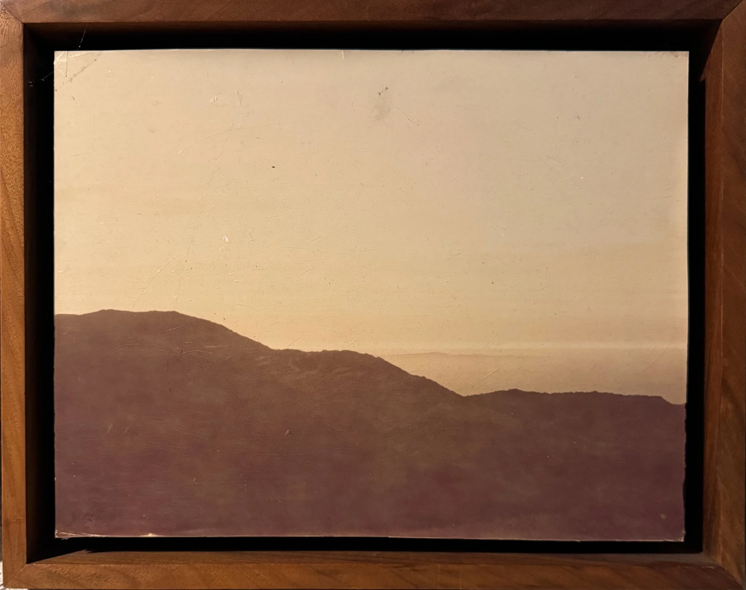
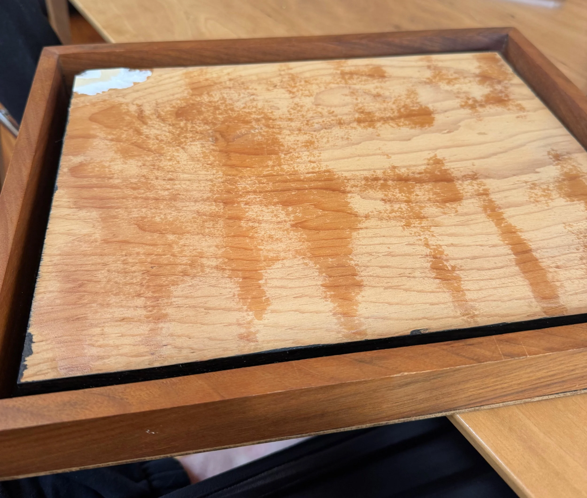
THE SUPPORT
First thing, I wanted to reuse an old Goodwill photo that was so faded but framed so nicely. Turns out it was pasted onto the frame and I could peel it off and then paint on the wood.
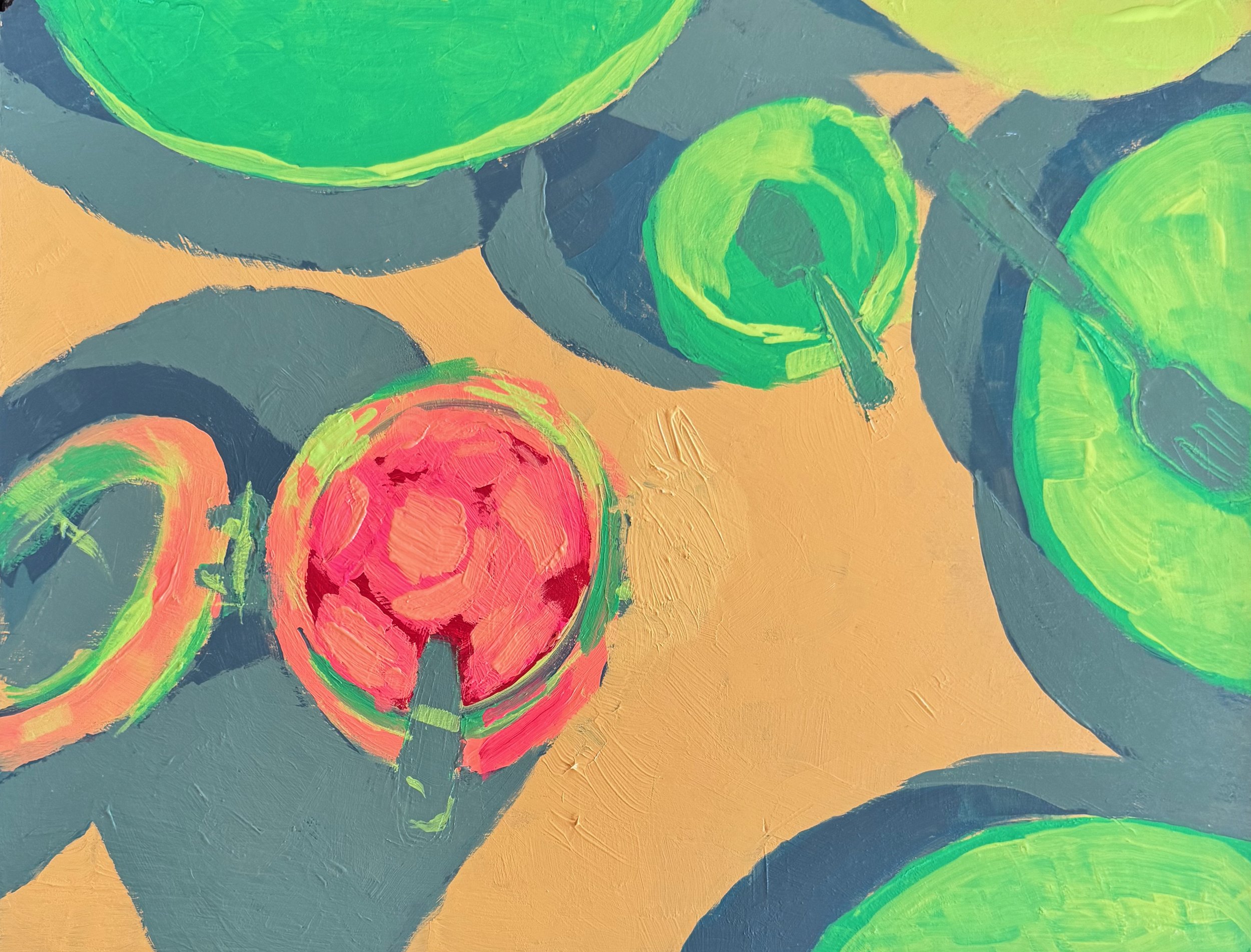
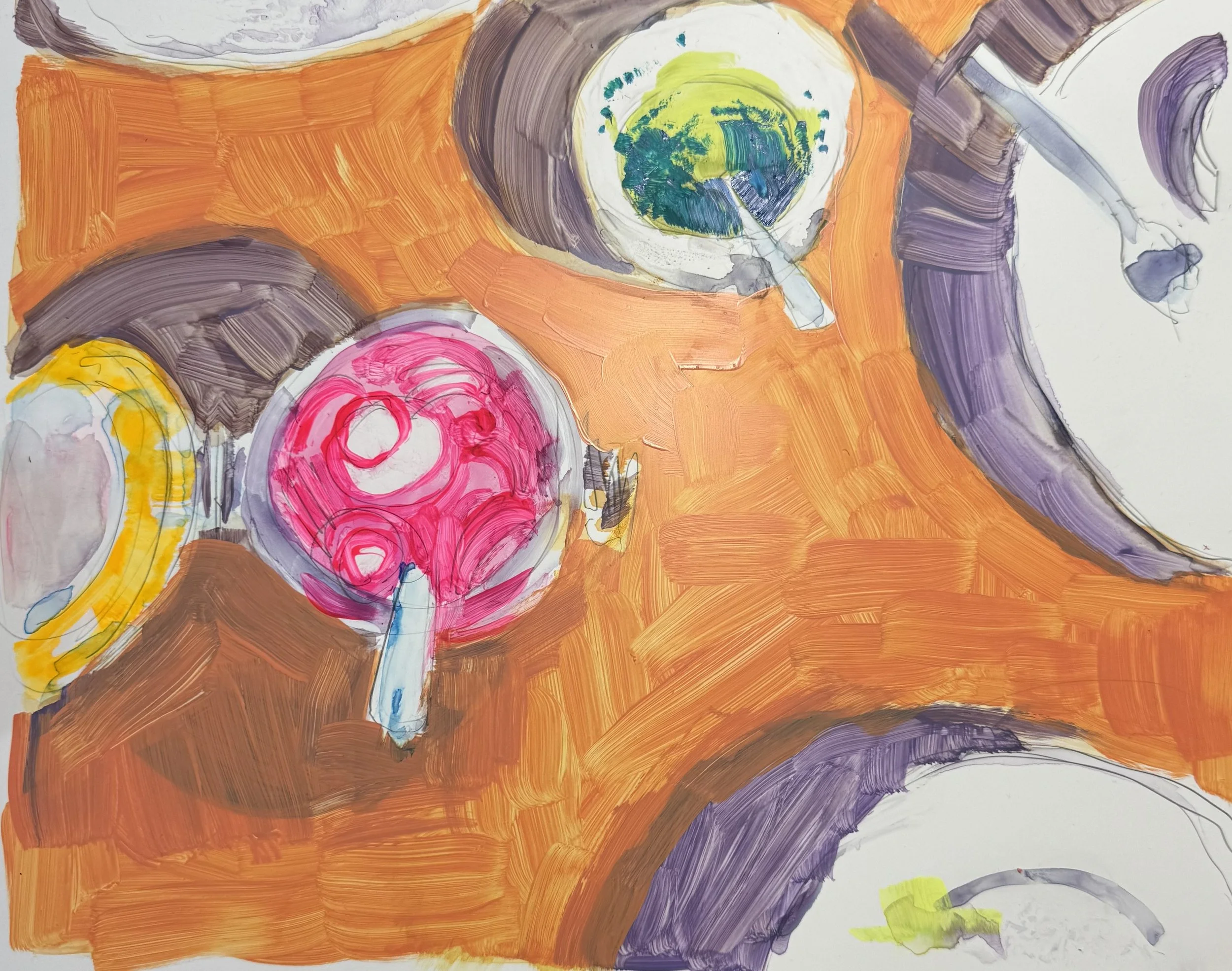
PALETTE
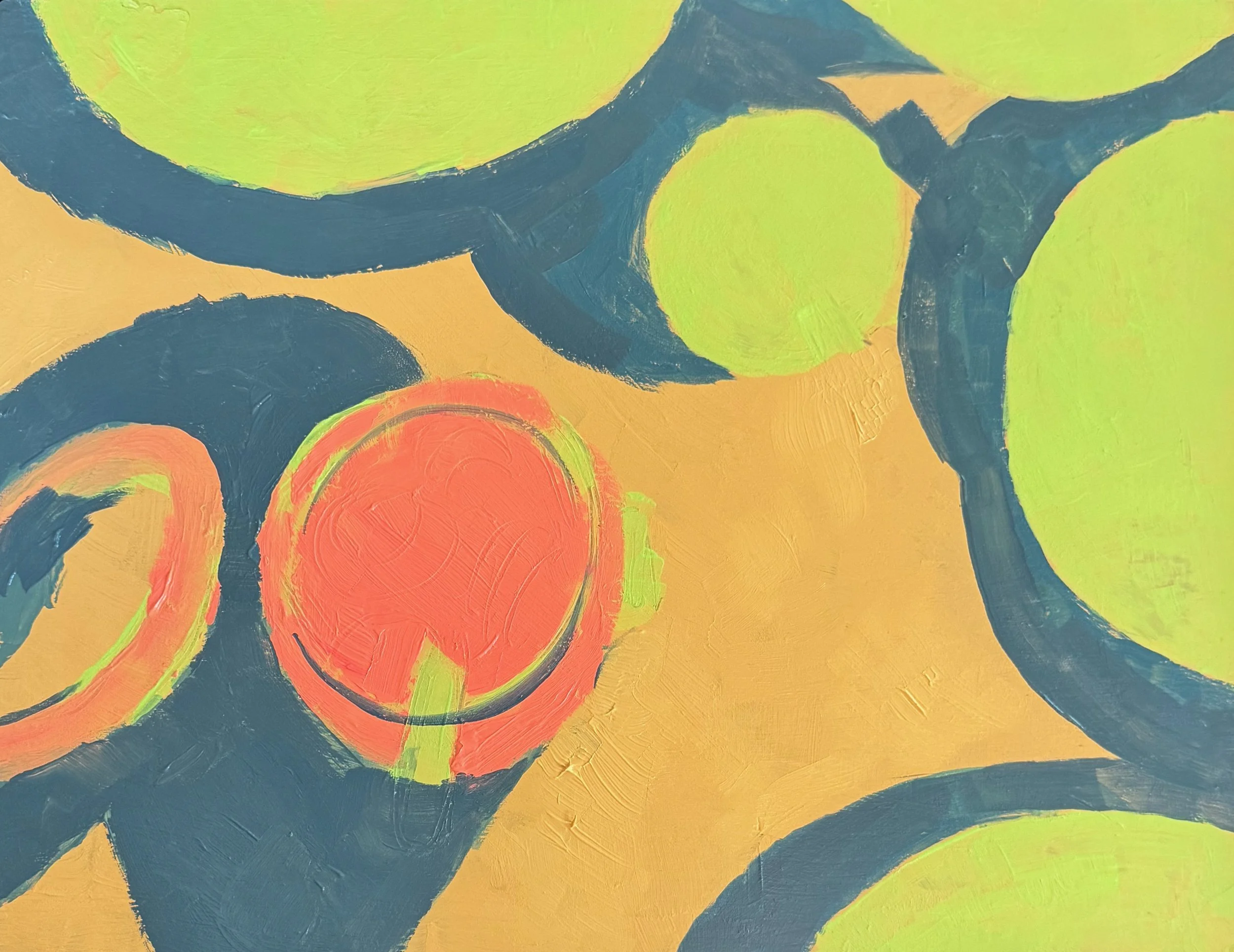
Secondly, I was at home so I didn’t have very many colors. So the palette was way limited - Naples yellow, hot pink, hot red, Volt sneaker paint, Hansa yellow light, a little bit of blue. This was a good thing because I had just attended an artist talk at Providence Art Club, where Bill Lane extolled the benefits of a limited palette. The only white I had was designer gouache and it is TEMPERAMENTAL and THICC so I used it sparingly. This is the murky tone I like - where you live in a world where there is no pure white save highlights. It’s bright but it’s not bright.
VERSION EVOLUTION
At first I wanted the “white” to be the lemon lime volt. I kind of like that, might return to that idea at some point.
Then I found my cranky tube of gouache and could make it actually lighter.
Then I really got into the competing light source shadow. I started thinking “maybe shadow should always be the whole palette mixed together.”